Tuesday, November 23, 2010

Demolition Day

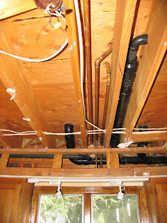
A big project like the master bath requires major demolition. Not only did all the fixtures, flooring, wallboard, and part of a wall need to come out, but our kitchen ceiling below ultimately needed to be completely removed to expose all of the plumbing that needed to be rerouted to accomplish the proper placement of the new plumbing in the master bath.

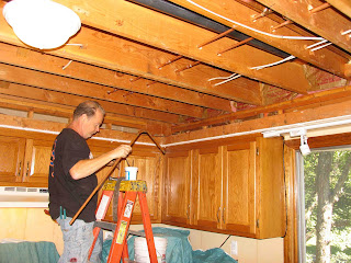
Another big obstacle was the soffit in the kitchen. We did not want it and our kitchen remodel would call to remove it. So, given that it was completely filled with plumbing and electrical it needed to be removed before we could continue with the master bath project.

Here is what it looked like:

I'm not sure they could have fit more plumbing or electrical into that soffit.
Soffit ran all the way into the eat-in area of the kitchen over the sliding glass doors. Ugh.

Steven is rerouting plumbing. He had already moved most of what was in the soffit and had torn much of the framing of the soffit out. We still had more demolition to go, but that could wait until we started the kitchen.
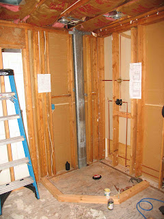
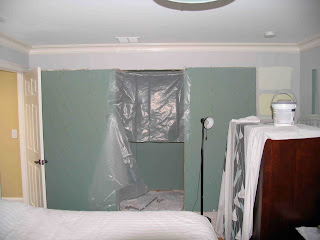
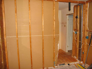
The bathroom was completely torn out as well by this time:

Wall separating the closet from the bathroom was cut back to create opening which would later turn into a hallway. That metal air duct in the wall on the left side of the photo had to be moved. That was where our new door was going.

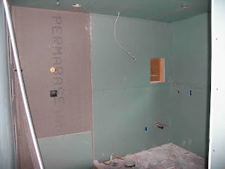
This was the rough-in on the shower and some plumbing work was already in place. 
That air duct you see in the above photo could not be moved. We didn't really notice it was completely in the way of our original shampoo box plan. The drywall installers were coming in the morning, so this resulted in a late night design session to rework the placement of all the shampoo boxes and the hand-held shower as well. Glad we noticed the problem in time to fix it.


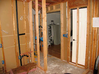
New doorway is framed in and rough-in electrical is in place. The T-wall is also framed in. To the left of it is where my vanity and sink will go.

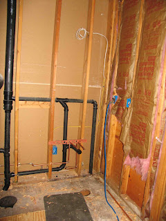
Rough-in plumbing is also in place. This is where Alan's vanity and sink will go.

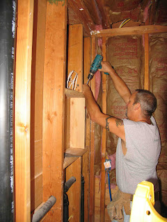
One of our ideas was to install recessed medicine cabinets over each sink. This did turn out to be a great idea. But, one of our lessons learned was not to frame them in advance as you see being done here. You just cannot judge center at this stage. Trust me.
The plumbing took a long time to complete. So much rerouting was necessary both because we moved and upgraded every fixture in the bathroom and we wanted to remove that soffit in the kitchen to clear the way for that renovation. Our plumber was also limited to evenings and weekends due to his full time plumbing job. Our carpenter, also our neighbor, was likewise limited in schedule, but there was much less carpentry work needed. Finally, we did get to the drywall stage.
We elected to use green board due to its moisture resistance. While unnecessary, we just continued it on the bedroom side of the wall.

The shower was framed out in cement board.

This is the side where my vanity and sink would go.

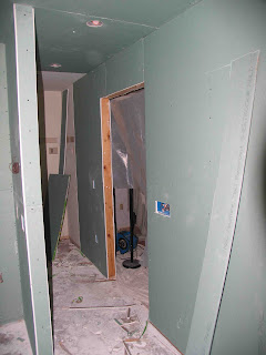
The new entry and hallway was shaping up well.

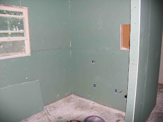
The window was one of the few elements to remain where it was.
While all the plumbing was being done, use of our bedroom was impacted. We normally let our four cats into the room with us at night, but we had to curtail that because the bathroom was all open, including some of the floor for a time. I could just see one of those cats getting electrocuted, falling in between the wall studs, or even jumping down into the kitchen from one of those holes in the floor. Yikes.

This situation got Alan to thinking that their room is right next to ours and we could put in a door so that we could remove all the kitty litter boxes, food, and water out of our room completely. I was resistant at first. It would cost money, tear up the other side of the bedroom, and would it really fit and look right in the other room? After a little testing of the spacing, I warmed to the idea. It turned out to be brilliant. It did tear things up for a while, but it is perfect.

The demolition process began on the new door to the cat room.
We still had the radiant heat to go in the bathroom and closet floors and then all the tile work for the shower and floor. The cabinets that we ordered at the beginning of the project were delivered and in the garage, so they were ready to do also. Stay tuned.

Thursday, November 11, 2010

Big Plans

I promised to post about the living room, but the photos weren't quite right and now I can't get into that room for a while because of the work we are doing on the first floor. Instead I will share the plan for the master bathroom, one of the two big renovation projects that we queued up after we made some initial progress on the smaller projects--and got rid of all that pink paint.

Take a look at what we started with in the master bath, a disaster:

Only one sink and small vanity cabinet. The seated vanity is nice, but it is too high and there is no room to fit a stool in the room anyway.
All fixtures were gray and there was flowered wallpaper everywhere. This tub took up all the space in the room. And, the toilet was wedged in the corner. 
Shower was small and dark.

This is the master bedroom before we moved in. The bathroom door is behind the open door to the bedroom on the left. This configuration just didn't work. These doors were always in the way of each other. The other door goes to the walk-in closet.
Walk-in closet was decent size, but not configured to hold much.
I really couldn't wait to get rid of the wallpaper in the bathroom, so we removed it when we removed all the other wallpaper. The wallpaper removal revealed some ugly surprises:
Apparently that tight space for the toilet didn't work for the previous owners. It got wet--often--and we found all this mold under the wallpaper.

We also found mold under the wallpaper by the shower door.
Once we determined that we did not have any current water leakage we began planning for this space while we worked on public rooms downstairs. We would ultimately have to use this bathroom as is for 7 months before we were ready to start demolition.

Here is the plan we developed:

This plan includes placement of all plumbing fixtures, lighting, and cabinetry. Circles with crosshairs indicate ceiling lights; circles with double lines indicate outlets, S indicates switches.
Our plan addresses all the problems with the space. We eliminated the doors to the bathroom and closet and replaced them with a double door on the center of the bedroom wall. We removed part of the wall that separated the closet and the bathroom and put in a T wall that would create a hallway instead.

We also chose a larger shower and no tub so that we could get two separate sink vanities, a seated vanity, and tall cabinets, significantly improving the working space and storage space.

Another concession we made was to have the toilet out in the room. There was not enough square footage in the space to allow for a reasonably sized room for the toilet while meeting all of our other more important objectives.

This floorplan did require that we replace the perfectly good hardwood floor in the closet since the floor needed to continue seamlessly from one room into the other.

We also decided on water-based radiant heat in the entire space. You can't install radiant heat unless you remove existing flooring, so now would be the perfect time. Also, this allowed us to remove the baseboard heat units in the bathroom and closet, which gave us more room for cabinetry. This heating method keeps the otherwise very cold tile warm under foot. It is also a very efficient heating method, particularly in colder climates. It made the floor higher than the hardwood in the bedroom, but it is less than 1" and with the threshold at the doorway it feels perfectly natural. The fabulous heat is well worth it!

Our plan was also to create a spa feel in the space. So we chose travertine tile with glass and shell mosaics to create a neutral palette. We also chose brushed nickel fixtures. The only color in the room would be paint color, towels, and accessories.

Come back and see how this project unfolds.

Sunday, October 31, 2010

Budget Bathroom Redo

Sufferers of renovationism do tend to get carried away with spending money on their projects. We were determined to be more budget conscious as we needed to redo every room in our house. Besides, frugal is the new black! The upstairs hall bath was the full bath that guests would use, particularly those that were staying in overnight. Plus, we knew we had a big renovation in the master bath coming up and wanted to ensure that we had a full bath to use during that project.

So, here is what we started with:

This is the real estate listing photo. The tub is to the left of the window. There is a linen closet to the right of the vanity.
In order to be frugal, we'd have to avoid tearing out the tub, the tile around the tub, the tile on the floor, and the toilet. It wasn't too bad, beige tile and off-white tub and toilet we could live with.

The wallpaper, vanity, sink, mirror, and light fixtures had to be addressed.

After stripping the wallpaper--one of the rooms where it did come off easily, we found suitable vanity and countertop with a sink in it at The Home Depot. In fact, they were running a special where you could get more of a discount if you bought more. Works for me. We bought the vanity for this room as well as the one in the powder room downstairs along with the mirror, and both faucet fixures all at once to get the maximum discount. We have a two car garage that has served nicely as a staging area for our projects. We hope to again park the cars in there soon. You know, it snows here.

Here is where we ended up on this project. We continued the crown molding and baseboard trim work in here and replaced the doors with the same six-panel doors we have used throughout the house.

We replaced the ceiling fixture with one that is also a vent fan. The shower curtain is a custom drapery with grommet top. That little splurge in an otherwise very cost conscious remodel gives the room character and color.
We also added this vanity light. There was not a vanity light fixture in here before.
With the proper paint and accessories, the existing toilet and floor looks great in here.
New doors and hardware complete the look.
Another feature we added to this bath was an air conditioning vent. We replaced the upstairs air system which allowed us to add vents in rooms that did not have them as well as add return air vents in all the upstairs bedrooms. This allows the system to run better.
We've been using this bathroom for three months as we did the renovation on the master suite. Aside from being a bit snug for two adults to use on a daily basis, we found it very comfortable and attractive. We know our guests will enjoy it.

My next post will be about the living room. It still lacks accessorizing, but the construction and furnishings are complete.

Saturday, October 30, 2010

A Touch of Terror to a Touch of Hollywood

Even though I suffer from renovationism, there is some logic and order to the compulsion. We have always plotted our projects with the public rooms as the priority, then moving to the private rooms. We did that in this house too. One of the scarier rooms in the house was the powder room on the first floor. It is the only bathroom on the first floor and clearly the one any guests would use. This is what we started with:

Yes, the floor is pink. And, the ceiling is bright pink.
We did not know the terror that lied beneath that wallpaper. When we took off the rattan towel bar and toilet paper holder we found that holes that were left by the prior ceramic versions. Then, the vanity counter top slid into a large slot in the wall and the wallpaper was just loosely tucked in.

It seems we didn't photograph much of the destruction stage. Perhaps is was just upsetting. Or, it might have been that this room is so small it is difficult to photograph. Here are a couple showing all the drywall patching we had to do in there.

Of course any time you have a cabinet vanity it is a 100% certainty that your pipes are not centered on where you will want that pedestal sink. The patches on the left were to fix the slot from the prior vanity countertop and the ceramic towel bar. At least the wallpaper came off easy in here, but it did reveal those nasty surprises.


This wall was not yet patched. That hole emerged when I peeled off the wallpaper.

Powder rooms are a great place for some design fun. This room is not meant for heavy duty use like a full bath and is also primarily used by guests. I thought I'd try a new palate for me and decided on what I ultimately felt was a very Old Hollywood feel.

We like pedestal sinks in powder rooms because of their great look. I also wanted to put in a fun, but classic, floor to replace the pink tiles. Then, I wanted to have some fun with the ceiling and lighting.

This is the floor in progress. The main tile is travertine, classic, but it is in planks like hardwood floor and set in that same type of random pattern. Then, for splash, I put in little strips of mosaic that consisted of travertine, clear glass, and frosted glass. Just enough fun without being too busy or too gaudy.
Here is the finished room.


You can see a bit of the ceiling in the photo above. There wasn't enough room for the standard crown molding we were installing in the rest of the house due to the vent fan placement. So, I got this tip from the rep at Ethan Allen when I was buying the dining room wallpaper for that ceiling. I put picture rail a few inches down from the ceiling and did the metallic treatment all the way through to that picture rail. The silver paint was put on in a swirling brush stroke style to look like brushed aluminum. Made a great tray ceiling.

You can see the funky little chandelier we put in. I had no idea it would create those light patterns on the wall. Bonus! With the slate purple wall color it looks like water. You can also see better in this photo that we have a trough style faucet. Another unique touch for this room.
We continued the theme of the tall baseboard and the painted six-panel doors. We think this is a fun room for guests and enjoy it ourselves as well.

My next post will be about the upstairs full bath. It is also a guest bath, so we wanted to get that one done early on.

Monday, October 18, 2010

Delicious Dining

It has been longer that I wanted since the last post. Sometimes life gets in the way. Been traveling quite a bit, at least for me, over the past few weeks. So, I'm hoping to catch up this week with some posts showing a few of the rooms as we have completed them. As promised, today's post is focused on our dining room.

Even before we knew we would move I wanted to update our dining room furniture. I had it before we were married (16 year anniversary just this month!) and it served us well in two houses, in two very differently decorated dining rooms. While we had some great times at that table, the light finish was looking very dated. Even though I left the set to be sold at our moving sale I'll always remember the good times. I mean who can forget the Thanksgiving meal where a laptop was brought to the table after the plates were cleared so that the conversation on the origin of helium could be backed up with research? Several of the folks that frequented that table are no longer with us. But, you know those great times were not about the actual table, so it is exciting to me, not sad, to design a new room with a new look.

Knowing that we would need new dining room furniture caused us to start designing that room as soon as we had a contract (and an appraisal that would work) on the new house. It takes 8-10 weeks to get furniture delivered in some cases. I really wanted a couple of those wing back chairs I'd seen in magazines. I couldn't find a full set that came that way that I liked, so I did mix and match. It worked out pretty well.

In my search for a table and chairs that would go with the wing back chairs I thought I had decided on, a sales person pointed out to me that standard wing back chairs are, a) enormous at a table, and b) the seat height is too low for dining. Good to know. Apparently designers do not try to eat at those tables they put together in magazines and catalogs. I finally found true dining wing back chairs at Ethan Allen (www.ethanallen.com). They are the perfect size and, very important, I could select the fabric.

I also decided on Canadel (www.canadel.com) table and chairs because I just can't resist the notion of selecting my table shape, table and chair legs, finishes, etc. It is like being a furniture designer! I found fabrics for both the Ethan Allen chairs and the Canadel chairs that went together beautifully. Took ordering swatches and comparing several options to do this since they were not from the same store. I didn't want everything to match, so I decided to wait on the sideboard(s) to see how the room came together. I figured we could eat in there as long as we had a table and chairs.

Dining rooms are a great place for some drama. Unlike a family room or bedroom where you might want serenity and comfort, a dining room is less frequently used and more of a showplace for company. So, we went for some dramatic elements in the finishes and the furniture.

Once we moved into the house we started renovating rooms, as you've seen. The dining room had great hardwood floors and a matching bay window with the living room on the other side of the entry hall. Here is what we started with:

Photo from the real estate listing.

And this is the empty dining room right before we moved in.
After refinishing the hardwood floors and installing crown molding and baseboards in all the rooms, the next task for the dining room was painting the new trim work along with the old baseboard heating units and the window:

The lovely construction paper covered these windows for quite some time until the finish work in the room was done and the new window treatments were installed.
My inspiration for the ceiling in this room was the powder room ceiling in my old house. I did a faux copper ceiling using vinyl wallpaper painted a copper color and then glazed it in dark brown:

This photo was taken once the ceiling was finished, the rest of the room was not complete. If you are interested in this room, you can see it on HGTV.com Rate My Space in the bathroom section. It is called "Old World Powder Room".
So, I set out to replicate this ceiling in my new dining room. Turned out harder than I thought given that I had already done this before. Scale was the culprit. Here is what happened:

I knew I needed a larger wallpaper pattern. I discovered this at Ethan Allen when I was ordering the wing back chairs. The sales representative listened to me describing my plans and found this for me. It was perfect. Getting it up on the ceiling of such a large room took me, my husband, two ladders, a broom, some tears, and anti-anxiety medication. You'll note we planned ahead so that the center of four of the squares fell exactly at the light fixture. This was not the same place as the exact center of the room. It is rarely the case that light fixtures get placed exactly in the center. They are always off just a little.
But, it turned out terrific. This vinyl wallpaper pattern was the perfect size for the room.
Now I had to paint it. In the old powder room I was able to get copper metallic paint at The Home Depot, but they do not carry that anymore. I found Modern Masters paint online and ordered the copper color. Pricey, but the only metallic paint I've ever worked with that could be rolled on evenly. Another important consideration when painting a large ceiling.

Given that I did most of the painting at night, this protection for my hair was a McGyver solution. Of course they make painter's caps, but I couldn't get one at 9 pm and I was on a deadline. Hey, it worked!
Since I couldn't use exactly the same paint as I had used in my old house, I did a test board. And, on one square the glazing technique worked.
Then, I proceeded to apply this technique to the entire ceiling. Neck breaking. And the bad news? It didn't work. Unlike that little powder room ceiling, I could not get this ceiling glazed evenly enough to look right. In this photo it looks ok because photos can never capture all your eye can see, but trust me--don't try this at home!
It was a setback, but it was fixable. I bought the bronze metallic from Modern Masters and painted the whole ceiling over again. It looks incredible!

We liked the contrast of the antique style ceiling fixture on the old style ceiling against the more contemporary furniture selections we made.
Then, I selected a similar color to what I had in my old kitchen and hearth room, an amber color, for the walls. This color is very dramatic and works well with the print on the wing back chairs and the solid on the side chairs. Every wall in our house took a lot of sanding and patching. The previous paint job--that pink that was everywhere--was sloppy. There were big globs and roller marks on every wall. My husband did all of that hard work. He sanded down the globs and I did the spackling so he could do the finish sanding. It was very frustrating and difficult work, but it was worth it because our new paint job is flawless.

Of course, the paint is flat when it dries. The color also mellowed when it dried down completely.
The furniture arrived about the time the prep work was complete. Here is the room with just the new furniture:

A good start. It was coming together.
We elected to put wood blinds in the same color as our trim work as a standard in all of our windows. Then, we did various types of drapery panels and rods for each room. I was attracted to fancier layered fabric options for the public rooms, but price finally swayed me. And, I believe keeping some consistency and simplicity in some of the finish selections is really important to keep the room from getting too busy. It is easy to get carried away.

And now the final reveal. A finished room down to the last accessory:


I'm still thinking this room might need a rug. What is holding me back is the size. I don't want to cover up much of this hardwood floor. The "correct" size for a rug is one that is large enough so that when the chairs are in use they still sit entirely on the rug. Then, you should have 18"-24" inches minimum between the edge of the rug and the baseboard. Even at 18" border, those wing back chairs would have the back legs off the rug when in use. So, for now I'm going to leave it, but I'm open to feedback on it.

I hope the next post to be in a couple of days instead of a couple of weeks. I'll share the downstairs powder room project.